You're probably thinking: "What the hell do I need copywriting for with a CTA? That thing has 3 words on it - 5 words tops!"
Well yeah, but those are the 3-5 most important words in your email (apart from the subject line). So give those words the attention they deserve.
Here's a bunch of tips and food for thought for you to draft the perfect CTA.
Preamble: Test, Test, Test
In the following chapter(s) I'll give you a lot of tips and best practices that have worked for hundreds of companies across dozens of industries.
Even with a track record like that there is no guarantee that any given tactic will work for you. That is why you need to get in a habit of testing each new tactic.
That is how successful companies grow: They test dozens of ideas until they find the one that works for them; and then they capitalize on it.
So give it a go and start testing.
Start with the CTA
Here's something my friend Josh Earl wrote in one of his emails:
It's easy to get focused on one particular marketing problem and forget that the early steps in your marketing funnel set up the later steps.
Take email courses for example.
A common mistake I see is this:
You decide that you want to create an email course to help you get people to sign up for your list.
So you sit down and think about what you could teach that people in your audience is interested in. You remember that people are always asking you about a particular topic, so you sit down and bang out a half dozen emails.
And at the end, you decide you want to put a pitch for your product. Except, shoot, you can't really think of a way to transition smoothly into talking about your product.
No matter what you try, it feels forced and unnatural. (This is where most people throw up their hands and say, "I hate selling!")
When you're putting together any marketing campaign, you have to think two or three shots ahead.
What's the next step you want the reader to take? And the one after that? Then build your campaign toward that goal.
He's got an excellent point here: When we draft a sales email (course) we need to keep the end result in mind. I know I've been guilty of that myself in the past.
What helped me overcome this problem was to start with the last paragraph of an article, the last email in a course, and the CTA in an email.
Inverting the order in which I write emails and articles helped me level up my (copy-)writing skills - and I bet it will do the same for you.
So the next time you write an email, write it in the following order:
- your primary CTA (goes at the end of the email)
- the supporting copy around your CTA
- the three paragraphs leading up to your CTA
- the rest of your email
Sounds weird - right? Give it a try nonetheless. You'll be amazed!
Tell people what to do with ACTION verbs
The worst thing you can do for your conversion rate is to leave your readers guessing what to do next.
- If you want people to buy your product, tell them to.
- If you want them to click a link and become a follower on Facebook, tell them to.
- If you want them to select a topic of interest (to better personalize your future emails), tell them to.
And when you tell them what to do, use action verbs. Don't just have a field for their email address and a button labeled "Do it!" (yeah, I've seen that one).
Use words like "Subscribe", "Buy", "Get", "Start", "Stop", "Discover", and so forth.
Here are 362 action verbs you can use.
Be specific
There's only one thing on your website that should sound like a dozen lawyers had a week of fun drafting that thing up: your brand new GDPR-compliant privacy policy(Yeah, we have one of those, too!)
Everything else needs to be clear and specific - especially your CTAs.
"Get your FREE 15-day course on email growth hacks" is better than "Find out more...".
You don't want people to wonder what will happen when they click on your Call-to-Action.
Reduce friction and improve usability
It seems like every time I start talking about usability and emails people immediately zone out... hard.
And yet having good usability and reducing friction improves your conversion rates for everything.
I've talked about visual design guidelines for email CTAs in a previous chapter and it brings the point across really well: If you design your CTAs so that they are hard to see/click on mobile, you will lose out on conversions.
Making the CTA work is a fundamental part of usability.
BUT, usability is also how easy you make it for your readers to take the action!
I wrote about the usability blunder of the German DoD here. It gets you shaking your head while madly laughing.
tl;dr: Don't make your CTA "print out the attached form, fill it in by hand, and then fax it back to us" while everyone else's CTA is "Click this link".
Improving the usability of your email CTAs
Obviously, you don't want your users to drop you a fax like it's 1999.
But there are other ways to improve the usability of your email CTAs:
Adding a <a href="tel:+15557582451"> link to any phone number allows people to call that number
from their cell phones.
Setting up an appointment through Calendly can be further streamlined by adding [email protected]
to your Calendly link. This pre-populates the name and email fields in Calendly and makes your reader's life
easier.
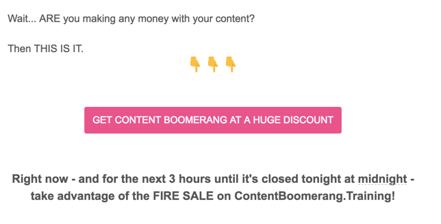
Only 24 hours left to convert more readers with the help of URGENCY!
Just like using urgency in the subject line helps you increase open rates so does urgency on your CTA help conversions.
Include words like "now" or "only today" on your CTA. Or if you have a limited number of whatever you're selling you can include that on or around your CTA. That also applies to free things like webinars.
"Join our webinar on email growth hacks now. Only 95 seats left!" can make for a good Call to Action.
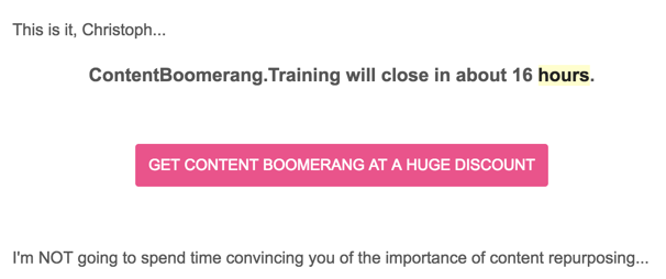
Urgency is your friend. It keeps people from thinking too much and focuses them on taking the action needed to improve their life.
Reduce the risk
Any action your readers take carries a (perceived) risk:
- Giving away your email address risks more spam emails
- Entering your credit card details risks fraud
- and so on
By reducing the perceived risk you can, in turn, increase your conversion rate. Depending on your offering there are different ways for you to lower the risk.
When you want to get someone's email address in exchange for a lead magnet mention that it is "FREE" in your CTA. There is an amble body of scientific research that supports the power of FREE.
If you offer a one-time payment product mention that there is "No Subscription!". This eliminates the perceived risk of paying for a subscription they're not using.
With SaaS products highlighting your free trial is always a good idea. Especially when it is "no credit card required".
Lastly, try to turn your reader's objections on the head by making the non-action seem like the worse idea. "Why not give it a try?" in the supporting copy can increase your conversion rates.
Supporting copy
The supporting copy is what immediately surrounds your call to action. It is an extension of your primary CTA. Here you can say the things that didn't fit on your button. Things like "no credit card required", "30-day money-back guarantee", and so forth.
Stomp objections
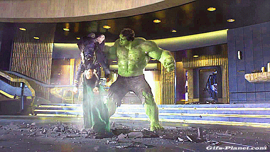
Before your readers take any kind of action they will have objections to it. Countering those objections is crucial because people experience anxiety every single time they take any kind of action. You need to stomp those objections into the ground hulk-style!
I've talked a bit more in-depth about this in the previous section on reducing (perceived) risk with your CTA copy and in fact both are almost identical.
Remember how I said that the supporting copy is the extension of your CTA?
You don't have space to write "Get more clients by signing up for our lead generation tool. There's a 14-day free trial and no credit card required, too!" on that shiny little button. That's what your supporting copy is for.
So in your supporting copy you try to squash the most important objections. Common objections are:
- "does this solve my problem?"
- "this is too expensive!"
- "I don't have time to learn all this stuff"
- "Will this add more items to my already overwhelming to-do list?"
You can counter those objections by re-iterating the outsized (financial) upside of your product compared to the imagined risk - e.g. "Hire us to increase your signup conversion rate by 10-15% and make a 100+ percent return on your investment within 3 months or less. If not, we'll gladly refund you in full!"
This way you emphasize the potential financial upside (10% more signups) and reduce the risk (refund policy) - obliterating two objections in one fell swoop.
Alternatively, if you're trying to sell them on a subscription in the §20 per month range, there's always the classic "for the price of just one Starbucks every week...".
Furthermore, you can crush some objections by delivering a/the benefit immediately after the "purchase". The most common example is the coveted ebook/PDF report/discount code-lead magnet when people sign up for a mailing list.
Lastly, you can use testimonials and social proof to counter objections. We'll discuss this in the next section.
Using testimonials to counter objections
Don't get me wrong: I'm sure you're a trustworthy person and don't lie to people. So, in theory, your readers should trust you when you tell that the objection they have in mind is irrelevant - except they don't.
I mean, come on. You and I know that we are not our most honest selves when we try to sell something.
Doesn't matter whether we try to sell a book, a SaaS subscription or our worthiness as relationship material when dating.
We'll present only the good things and sweep the bad stuff under the rug. Transparency is hard.
And that's why people don't trust you when you're selling them - at least not as much as their peers.
Testimonials to the rescue!
So instead of you harping on how frickin' fantastic your latest-and-greatest product/email course/whatever is, you bring in real people to talk about the wonders your offering has done for them.
Here are a few tips for using testimonials:
- include the name, position, company, and a profile pic next to the testimonial for maximum effectiveness
- don't write the testimonials yourself. It will sound sales-y
- Let your customers write the testimonial and edit it lightly, then give it to your customer for approval. Keep their voice and their unique wording in it
- Select testimonials to counter the most common objections. People complain about the price? Find a testimonial about the outstanding value someone got from your product
- Shorter is better. If you can't shorten it, emphasize the important parts with bold or italic text
Whenever you interact with your customers keep an eye out for great testimonials. Some of the best testimonials I got were buried in back-and-forth email exchanges.
Additionally, you can set up an NPS survey for your customers/clients and ask promoters for testimonials.
There's another way to counter basic objections with social proof: the "as seen on" banner; a collection of logos from companies/websites/news outlets your prospects know and trust. The idea is that if people see your startup was mentioned on Forbes and Entrepreneur.com and you were on the cover of Time magazine that they will deem you as trustworthy.
This can also take the form of "Join XX,XXXX happy customers!". Its implication is "there are 10,000+ people just like you and they all profited from this product. There's value here!".
Take a look at Rob Walling's website that uses both variations of social proof:
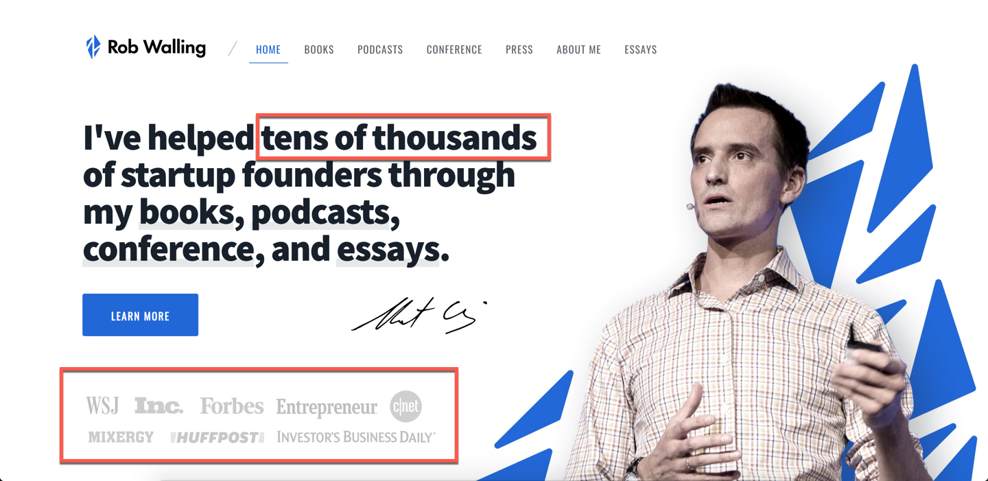
This technique is widely used on websites, but who says you can't use it in emails, too?
Provide visual cues
Here's another tactic that increases conversions: Provide visual cues - like arrows, pointing emojis, photos of people looking in a certain direction - that point towards your CTA.
Ever the other person you're having a conversation with look past you? That urge you feel to turn around and look at what they're looking at is overwhelming.
You can use the same effect in your advertising. Take a look at this Facebook ad creative I created a while ago:

See how that lady is facing the CTA button? That's what I'm talking about.
Or take a look at this email from TrafficGenerationCafe and notice the emojis pointing towards the CTA:
These emoji fingers pointing towards the CTA are another form of visual cues.
Try them out some time.