There are quite a few mistakes one can make when crafting CTAs.
You'll avoid them if you follow the guidelines laid out in the previous chapters, but just to drive the point home (and for some light entertainment) here are some common ones.
Not following through on your promises
I'm putting this first, because it happened to me recently - albeit with a website CTA.
I was shopping for sunglasses, so I went to an online-shop and got hit with a modal ad promising me a 5 € discount for signing up for their newsletter. Being the cheapskate that I am, I signed up for their newsletter for men's sunglasses.
You think you know where this is going, but you don't.
Anyways, I'm signing up in a heartbeat; giddy for my discount. Minutes later I receive the first email from them.
I'm astonished: They have a flash sale going - cool!
25% off on women's sunglasses. #sadface
Bonus: The email with the promised 5€ discount code never arrives.
They've let me down on two promises in one go: no discount AND I get the wrong newsletter.
Let's just say that I didn't buy from them...
When you create your CTA make sure you keep your promises after people click on it!
No CTA or a hidden CTA
Sometimes you don't want or need a CTA and that's fine. Maybe you just want your readers to read(!) your emails, share a story with them, teach them something, make them think.
But at some point, you want to sell something and not having a CTA or having a hidden CTA can kill your sales.
So how do you hide a call to action?
It's simple, you place so much clutter around it that no one knows where to click anymore.
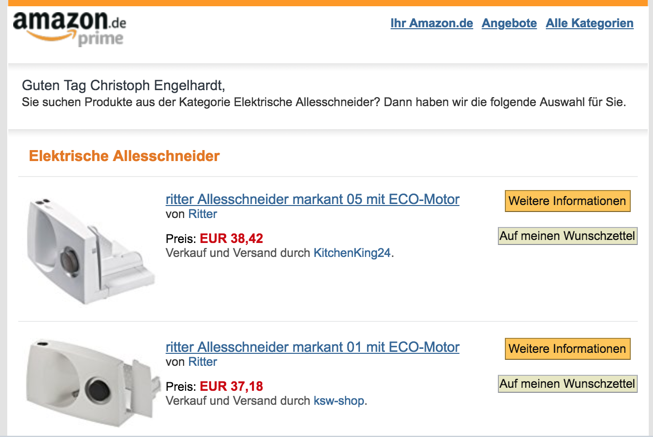
Look at this part of an email from Amazon. It has nine (9!) CTAs you can click - in just that screen. There were at least 40+ CTAs in the rest of the email (click the image to see the email in all its glory).

I'd split test an email with just 1-3 product recommendations, based on the average consumer rating, and big "Buy now!" buttons. If it converts better than this list, I'd test an email with just one product, too.
Another great way to hide your CTA is to just have one picture, that can be clicked, but doesn't communicate that in any way:

Image take from this article
That's how you hide a CTA!
Broken email Calls-To-Action
Check out this heads up/complaint on Twitter:
@hipcampers heads up - the CTA button in the email about First Camper Pledge doesn't allow me to click on it. https://t.co/mywudVe45e
— Dylan (@Scandylan) 11. Juli 2018
How embarrassing is it to have one of your readers point out on Twitter - in public - that your email links are broken?
Man, I get red in the face just thinking about it - and this time it wasn't me who got caught.
So yeah, make sure your CTAs actually work and you didn't forget to add links to your CTA buttons. Better yet: Make a habit of employing SendCheckIt as described in the Basics of Email CTAs chapter to catch those errors before your readers - and save yourself the embarrassment.
Not testing your CTAs
Look: This is the highest-impact mistake that almost every business makes.
You've read at least one of those "How we have 3x'd our conversion rate with this one little trick". Maybe you are annoyed by them.
But here's the thing: They might seem hipe-y, but they are true --> testing works.
Sure, you'll run ten tests and nine will fail. Five will fail horribly, performing worse than your control.
BUT that one test improves your signup rate by 10%. And the next test reduces your churn rate by 40%.
Remember: These improvements do NOT add up - they multiply!
So those two tests don't give you a 50 percent (40% + 10%) increased bottom line. It gives you an 83 percent increase in revenue.
The key takeaway here is not to focus on finding that elusive growth hack that turns things around for you but to focus on the underlying strategy of testing different tactics until you find the one that works.