Designing the call to action is the part of the process that many marketers spend most of their time with. I advise against that.
Instead, go with a "minimal" design as it reduces the time needed to make your design work across all the different email clients.
Here are some rules you should follow when designing your CTA:
Rule #1: Use a button for your primary CTA
Just like we're trained to use door handles to open door, we are trained to click buttons to do things on the internet.
Use buttons to make it clear to your readers that this is where they can take action - at least for your primary CTA. Your secondary CTAs usually come in the form of a normal text link.
Buttons as CTAs in email increase the conversion rate by up to 45% - just in case you needed any more convincing.
Rule #2: Use at most two buttons
This is basically an extension of the "Only one CTA per email" principle: Do not use more than two buttons in your email otherwise it gets cluttered. In most cases I recommend having only one button.
When you use two buttons, please let both of them be the same call to action - i.e. don't ask your readers to "buy [product] now" on the first one and "follow us on Facebook" on the second one.
Rule #3: Use text links for secondary CTAs
The rest of the rules are mostly concerned with the primary Calls-to-Action, but here's one rule just for the secondary CTAs.
Use plain old text links for the secondary CTAs. People know that they can click on the blue, underlined text. At the same time, blue text does not distract too much from your primary CTAs/buttons.
Rule #4: Avoid images, use HTML
The quick and dirty way to create a CTA is to use a button generator on the internet and include the resulting image in your email.
The problem here is that a lot of email clients will block images by default, meaning your readers will end up with the most eloquent sales emails of all times but without something to click on. Your conversion rates will suck. You'll lose out on a bunch of sales. Your life will be miserable.
Additionally, images increase the load time of your emails for mobile users. Increased load times result in lower conversion rates - compounding the overall effect.
So don't do that and instead use plain HTML to design your button (again: test across a range of email clients). That will save you from the despair that comes with a messed up sales email.
Rule #5: Make sure your CTAs work on mobile devices
I'm not going to play the same old fiddle again, but... just as your email needs to be responsive/mobile-ready your CTA needs to mobile-ready, too!
The question is: How do you ensure that your CTA looks good on mobile?
According to Apple, the minimum size of your button should be 44 by 44 pixels, because that's big enough to hit with a finger.
The font size should be no less than 16 pt so that it stays legible.
Rule #6: Do the squint test
After you've designed your Call-to-Action make sure to use the squint test to see whether it works.
This is fairly simple: Look at your email on a mobile device (or use Chrome's device mode), squint your eyes, and scroll through your email. Does the CTA pop out even with squinted eyes?
If so, you're good to go.
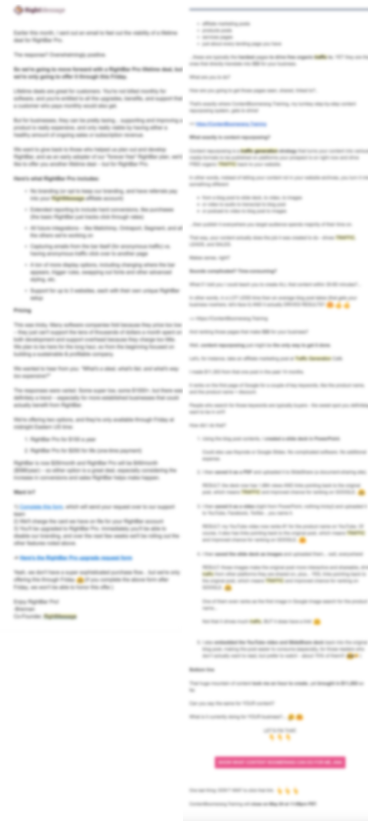
Here's an example of two emails I received. Both are the final email in a launch/sales campaign.
Can you guess where the CTA is in each email? Which email makes it easier to see the CTA?

Not that complicated - right?
In the next chapter, you'll learn to find the right words for your CTA. Check it out!